Design System
Rackscope uses a shared component library located in frontend/src/app/components/. All pages use these components to ensure visual consistency across the application.
Live showcase
Navigate to /templates/default (or UI Library in the sidebar) to see every component rendered with all its variants and states — buttons, forms, status indicators, overlays, feedback states, and more.
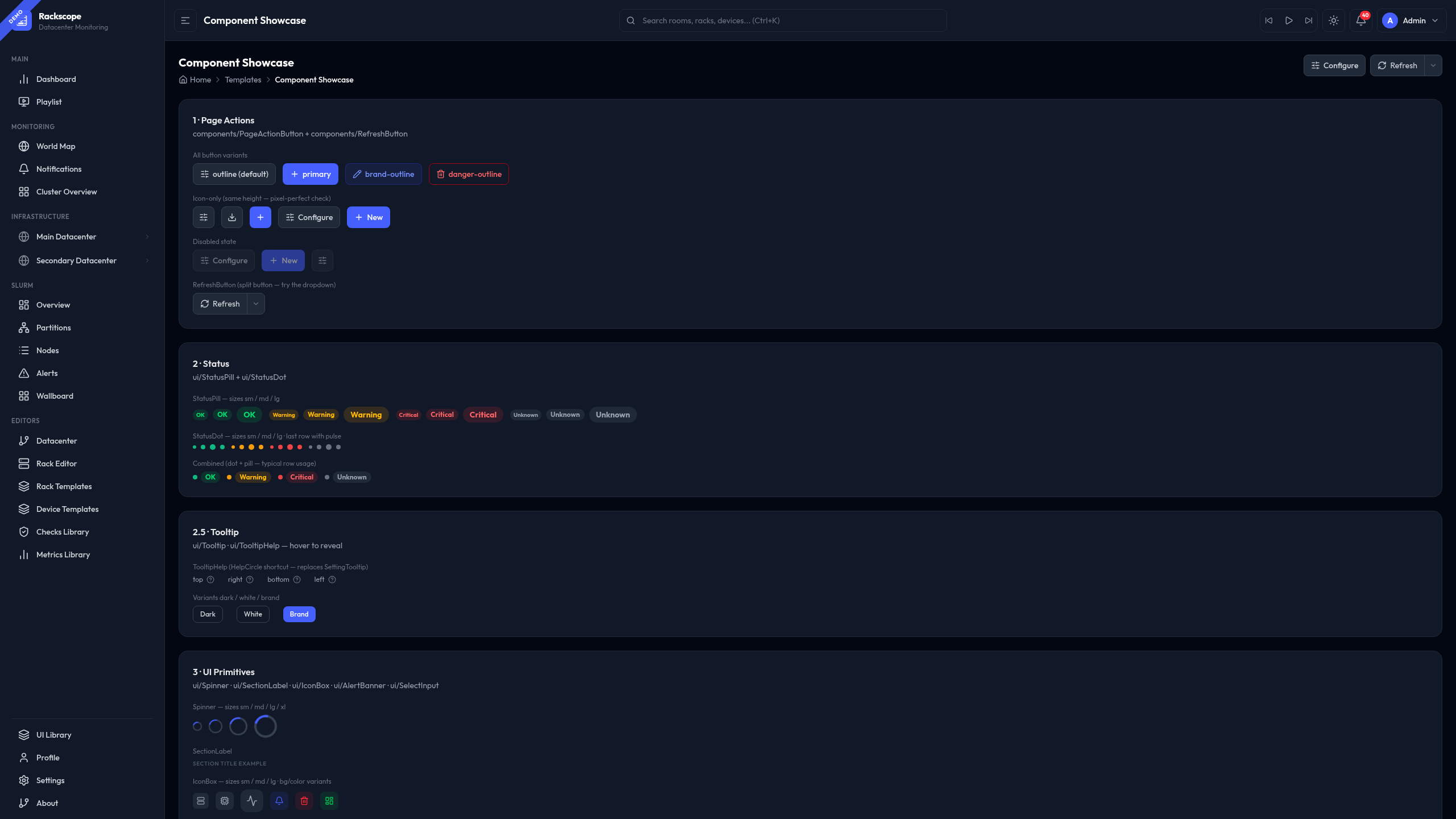
The showcase page is the authoritative reference for any component: it shows real usage, all size variants, dark/light mode rendering, and interactive states.
Component categories
| Category | Path | Key components |
|---|---|---|
| Layout | components/layout/ | PageHeader, PageBreadcrumb, SectionCard, Drawer, DrawerHeader, Modal, Tabs, ConfirmationModal |
| Actions | components/ | PageActionButton, PageActionIconButton, RefreshButton, useAutoRefresh |
| Forms | components/forms/ | FormRow, SearchInput, SegmentedControl, FilterPills, ToggleSwitch, NumberInput, StepperInput |
| UI Primitives | components/ui/ | StatusPill, StatusDot, IconBox, AlertBanner, SelectInput, Tooltip, TooltipHelp, KpiCard, StatefulSaveButton |
| Feedback | components/feedback/ | LoadingState, EmptyState, ErrorState |
Quick-start — new page
import { PageHeader, PageBreadcrumb, SectionCard } from '../templates/EmptyPage';
import { RefreshButton, useAutoRefresh } from '../../components/RefreshButton';
import { PageActionIconButton } from '../../components/PageActionButton';
import { usePageTitle } from '../../contexts/PageTitleContext';
import { SlidersHorizontal } from 'lucide-react';

export const MyPage = () => {
  usePageTitle('My Page');
  const { autoRefreshMs, onIntervalChange } = useAutoRefresh('my-page', loadData);

  return (
    <div className="space-y-6">
      <PageHeader
        title="My Page"
        breadcrumb={
          <PageBreadcrumb items={[{ label: 'Home', href: '/' }, { label: 'My Page' }]} />
        }
        actions={
          <>
            <PageActionIconButton icon={SlidersHorizontal} title="Settings" onClick={openSettings} />
            <RefreshButton
              refreshing={loading}
              autoRefreshMs={autoRefreshMs}
              onRefresh={loadData}
              onIntervalChange={onIntervalChange}
            />
          </>
        }
      />
      <SectionCard title="Content">...</SectionCard>
    </div>
  );
};
Settings — Appearance
The Settings > Appearance tab is the primary place for operators to customize the visual experience. It surfaces all theme controls with live preview and links directly to the UI Library.
What you can configure
- Accent color — controls interactive elements (buttons, active sidebar items, focused inputs). 5 options: Indigo (default), Violet, Emerald, Rose, Amber.
- Color palette — full dark/light theme. Dark options: Void, Navy, Forest, Matrix. Light options: Slate, Warm, Cool, Solarized.
- Tooltip style — controls how device health tooltips appear on hover in rack and room views. 6 styles: Tinted, Compact, Glass, Split, Terminal, Ultra-compact. A live preview card shows the selected style instantly.
- Severity label customization — rename the default OK / WARN / CRIT / UNKNOWN labels per deployment.
- Open UI Library link — shortcut to
/templates/defaultfor component reference.
All changes apply immediately and are persisted in localStorage under the rackscope.* namespace. No page reload or backend restart is required.
Design principles
- Dark mode first — all components render correctly in dark mode (the default for NOC environments)
- Consistency — use shared components, never reinvent inline patterns
- Composability — components are designed to work together (
FormRow+ToggleSwitch,SectionCard+KpiCard, etc.) - Accessibility — ARIA attributes, keyboard navigation, focus states throughout