Dashboard
The Rackscope dashboard is a fully customizable grid of widgets showing infrastructure health at a glance.
Layout
The dashboard uses a 12-column responsive grid (react-grid-layout). Each widget can be:
- Dragged to any position
- Resized freely
- Added or removed from the catalog
- Arranged across multiple named dashboards
Edit Mode
Click the Edit button (pencil icon) in the header to enter edit mode:
- Drag widgets by their grip handle
- Resize by dragging any corner
- Remove widgets with the × button
- Add widgets from the catalog (+ button)
- Reset layout to default
- Save or Cancel to confirm changes
Multiple Dashboards
Create multiple dashboards for different use cases (Overview, NOC, Slurm, etc.). Use the dashboard selector in the header to switch between them.
Operations: Create · Duplicate · Rename · Delete · Playlist toggle · Open as page
Standalone dashboard URLs
Every dashboard is accessible at /dashboard/<id> — a deep-linkable URL that loads the correct dashboard regardless of your local active-dashboard selection.
Click the ↗ (ExternalLink) icon on a dashboard tab to open the current dashboard in standalone mode.
This is useful for:
- Bookmarking a specific dashboard directly
- Running two dashboards side-by-side in separate tabs
- Embedding a dashboard URL in NOC runbooks
Playlist integration
Each dashboard tab shows a ListVideo icon. When lit (amber), the dashboard is included in playlist rotation accessible at /dashboard/<id>.
Configure playlist rotation in the Playlist Center.
Widget Catalog
Infrastructure KPIs
| Widget | Description |
|---|---|
| Stat Card | Single KPI: Sites / Rooms / Racks / Devices / CRIT / WARN |
| Stats Row | All 6 KPIs in a single row |
| Health Gauge | Global health score (0–100%) |
| Severity Donut | OK/WARN/CRIT/UNKNOWN distribution |
| Alert Count | Total active alert count with severity badge |
Monitoring
| Widget | Description |
|---|---|
| Active Alerts | Paginated WARN/CRIT alert list with rack/room navigation |
| Recent Alerts | Latest 5 alerts |
| Node Heatmap | All nodes color-coded by health state |
| Rack Utilization | Device/slot occupancy across all racks |
| Check Summary | Check counts by scope (node / chassis / rack) |
Infrastructure
| Widget | Description |
|---|---|
| Infrastructure | Device counts by type (server, switch, storage, PDU, cooling) |
| Device Types | Device type distribution chart |
| Catalog Checks | Active check counts from the checks library |
| Uptime | Simulated uptime counter |
Maps & Connectivity
| Widget | Description |
|---|---|
| World Map | Interactive site map with health markers |
| Site Map | Site status overview |
| Prometheus | Prometheus connection status, scrape stats, latency |
| Container Stats | Memory and CPU usage for backend, simulator, and Prometheus processes |
Slurm (requires Slurm plugin)
| Widget | Description |
|---|---|
| Slurm Cluster | Node state summary (idle, alloc, down, drain) |
| Slurm Nodes | Per-partition node distribution |
| Slurm Utilization | CPU/memory allocation gauge |
Simulator (requires Simulator plugin)
| Widget | Description |
|---|---|
| Simulator Status | Running state, active scenario, active overrides count, update interval |
Plugin widgets are hidden automatically from the Widget Library when their plugin is disabled.
Widget Library
The Widget Library panel lists all available widgets grouped by category. It only opens in Edit mode.
How to use it
- Click Edit layout (top right)
- Click Widgets — the panel slides in from the right
- Browse widgets by group and click + Add to place a widget at the bottom of the grid
- Widgets already on the dashboard show Added (greyed out — one instance per type)
- Click ↺ Reset to default layout at the bottom to restore the factory layout
Groups
| Group | Widgets |
|---|---|
| Stats | Stat Card, Alert Count, Scrape Latency, Slurm Nodes* |
| Charts | Health Gauge, Severity Donut, Rack Utilization, Slurm Utilization* |
| Monitoring | Active Alerts, Recent CRIT, Node Heatmap, World Map |
| Overview | Infrastructure (rooms list), Site Map, Prometheus, Container Stats, Slurm Cluster*, Simulator Status** |
| Catalog | Catalog & Checks, Check Summary, Device Types |
* Requires Slurm plugin — hidden when disabled. ** Requires Simulator plugin — hidden when disabled.
Widget titles
All widgets display a standardized title bar at the top (controlled by showTitle in widget config).
Stat-panel widgets (Stat Card, Alert Count, Health Gauge, etc.) hide the title bar by default.
Title alignment: Configurable in Dashboard Settings (gear icon) → Widget title alignment: Left or Center.
Extending the system
The widget system is modular — each widget is a self-contained file. Creating a new widget requires 3 steps: one new file, one type entry, one import line. See the Dashboard Widget System developer guide.
Persistence
Widget layouts are stored in localStorage under rackscope.dashboards (schema version 4).
They are not synced to the server — each browser has its own layout.
Each Dashboard object persists:
id— stable identifier used in/dashboard/:idURLsname— display name shown in tabswidgets— array of widget positions and typesinPlaylist— whether this dashboard is included in playlist rotation
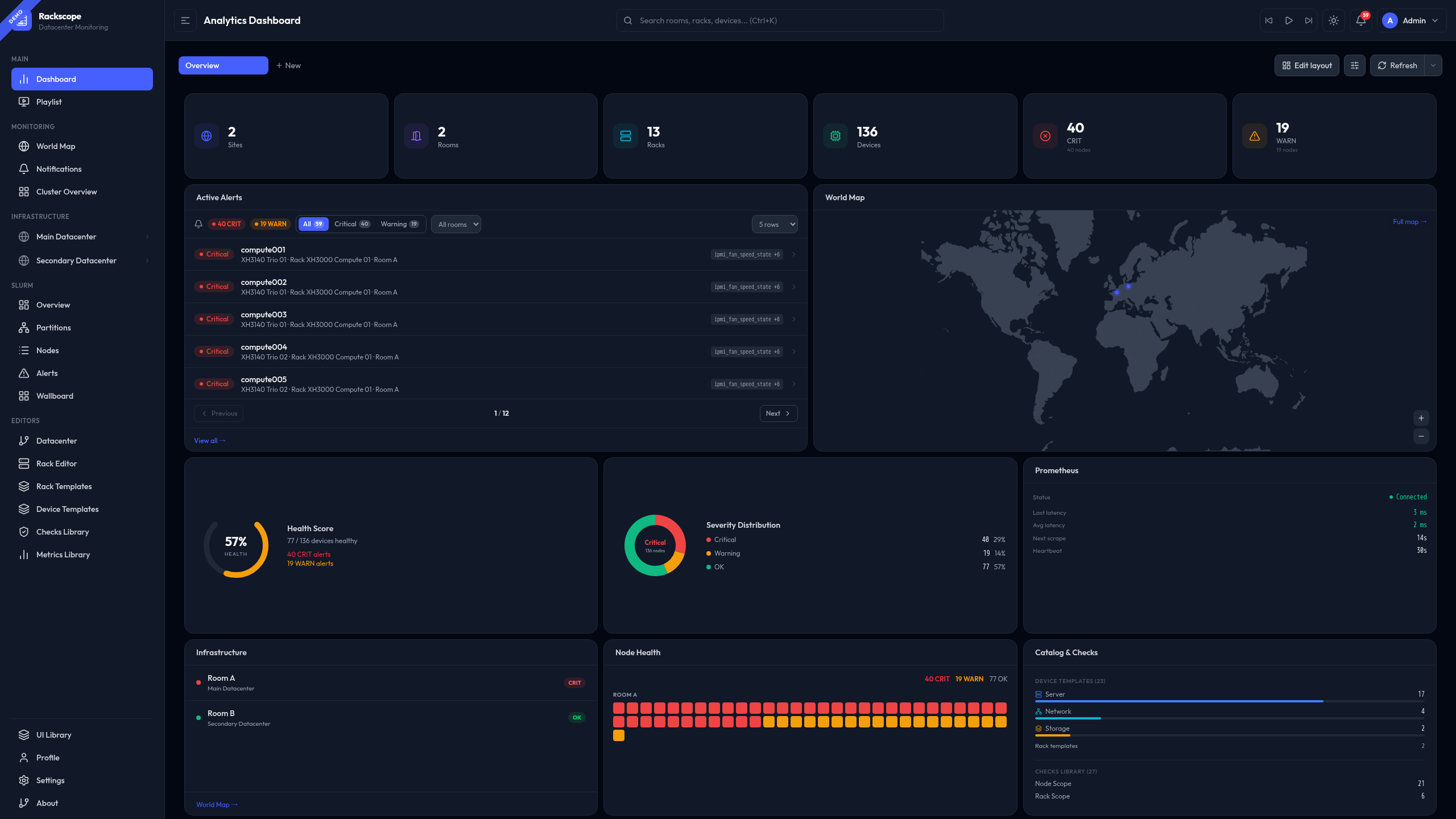
Default Layout
On first load (empty localStorage):
- Row 0: 6 stat cards (Sites · Rooms · Racks · Devices · CRIT · WARN)
- Row 1: Active Alerts (left) + World Map (right)
- Row 4: Health Gauge · Severity Donut · Prometheus
- Row 6: Infrastructure · Node Heatmap · Catalog Checks