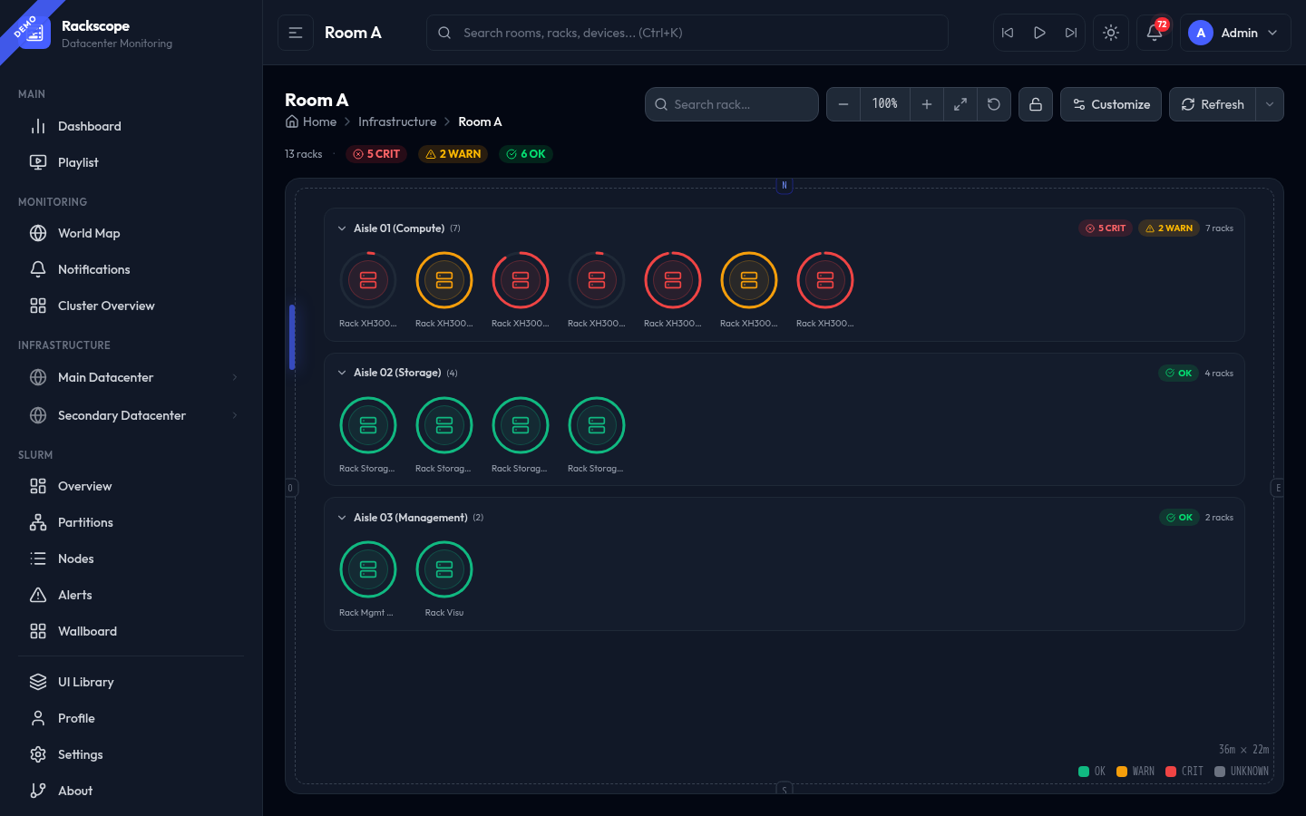
Room View
URL: /views/room/:roomId
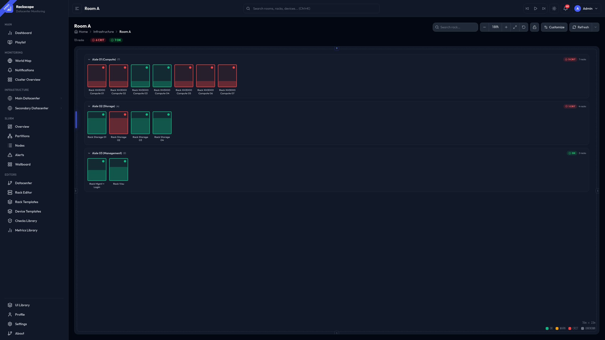
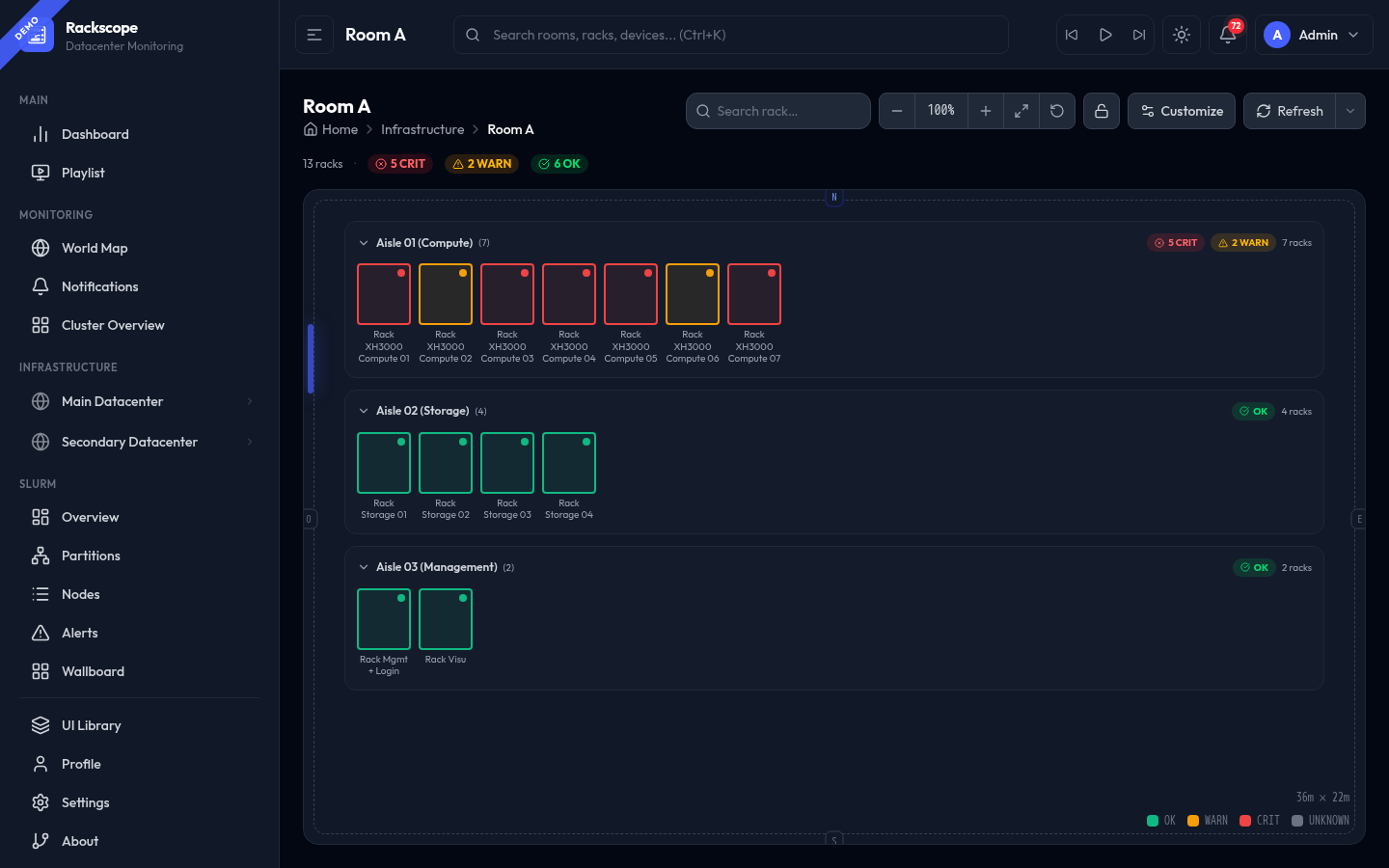
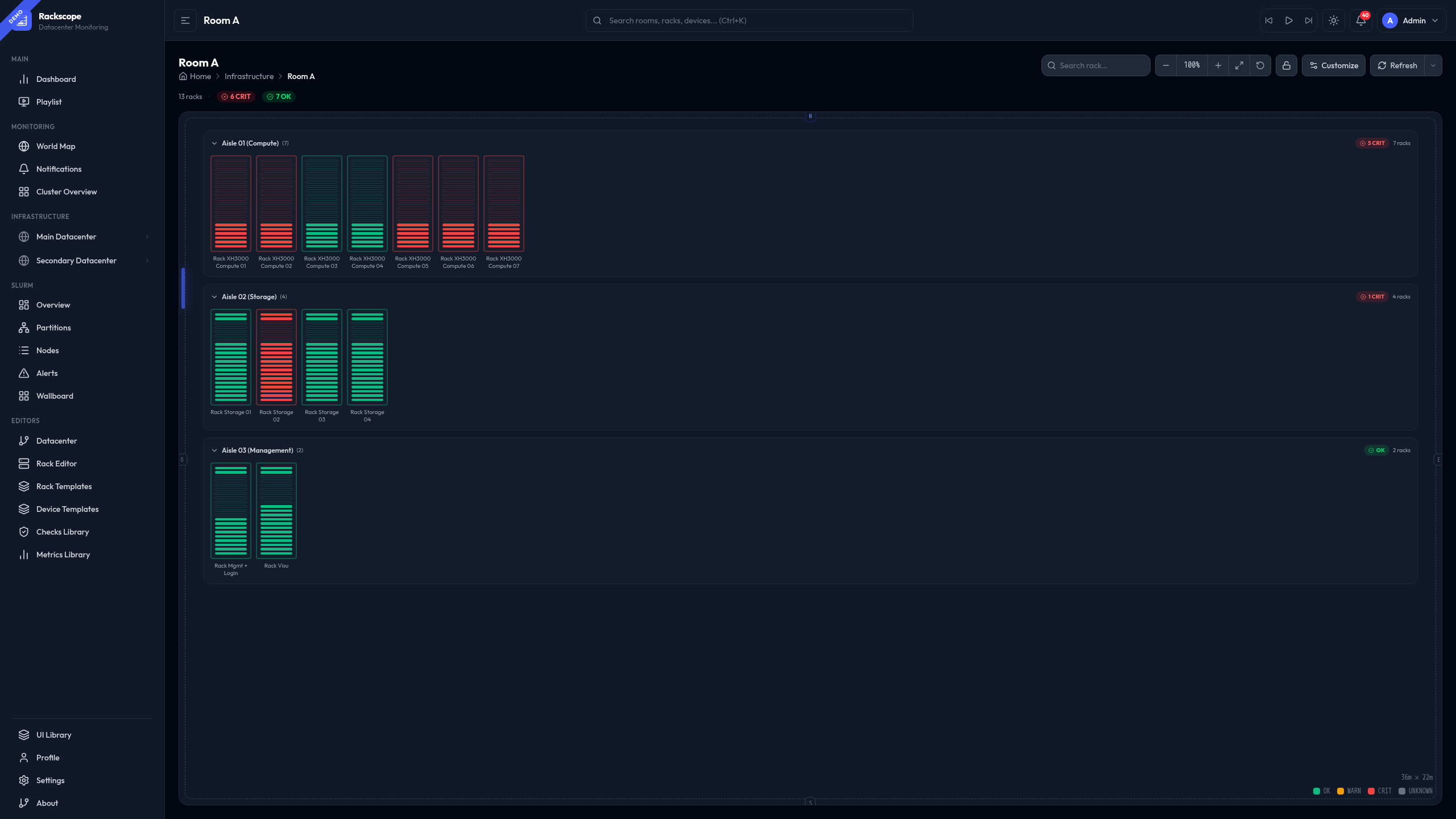
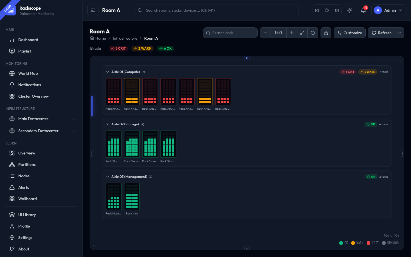
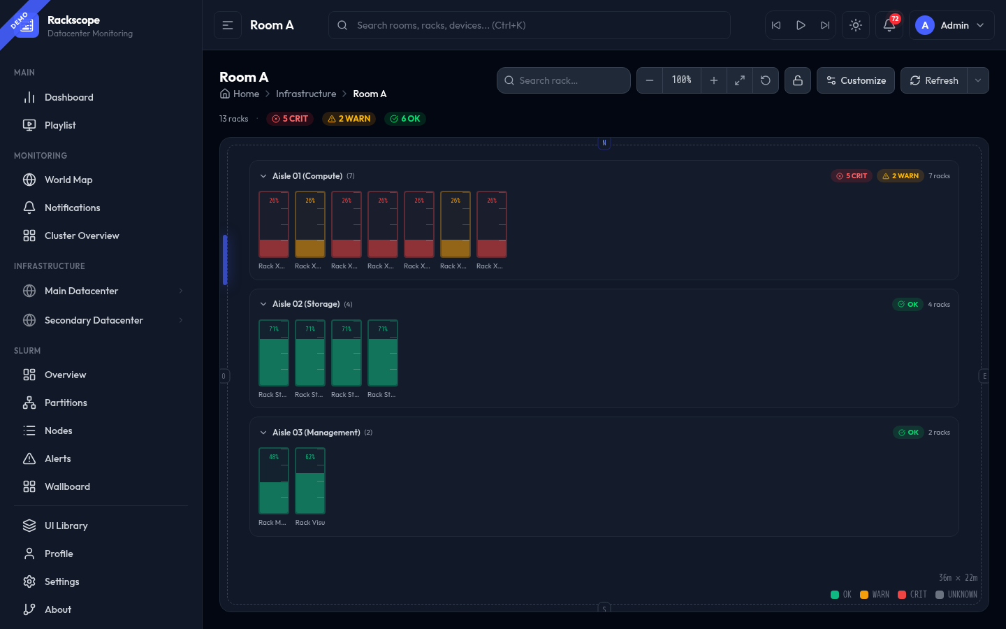
The Room View is the primary monitoring view. It displays all racks in a room grouped by aisle, with real-time health state from Prometheus. Each rack is represented by a visual cell whose style, size, and density are fully configurable.
Navigation controls
| Control | Action |
|---|---|
| − / + | Zoom out / in (also Ctrl + scroll) |
| Fit (↔ icon) | Reset zoom and pan to show all racks |
| Reset (↺ icon) | Reset to default zoom level |
| Lock (🔒 icon) | Toggle pan lock — prevents accidental panning |
| Scroll wheel | Zoom (when wheel-zoom is enabled in Customize) |
| Click + drag | Pan the room canvas |
| Search rack… | Filter racks by name or ID |
Health summary bar
Below the page title, a quick summary shows the overall room state:
13 racks · ⊗ 5 CRIT · ⚠ 2 WARN · ✓ 6 OK
Clicking CRIT or WARN highlights only the matching racks; all others are dimmed. Click again to clear the filter.
Aisle bands
Racks are grouped into aisles. Each aisle band shows:
- Aisle name and rack count
CRIT/WARNcounters (clickable to filter within the aisle)- ▼ / ▶ collapse toggle — collapse an aisle to save screen space
Rack tooltip (HUDTooltip)
Hovering over any rack opens a configurable HUDTooltip showing:
- Rack name, ID, height, occupancy
- Node health summary (✓ OK / ⚠ WARN / ✕ CRIT counts)
The tooltip style (Tinted, Compact, Glass, Terminal…) is set in Settings → Appearance → Tooltip style.
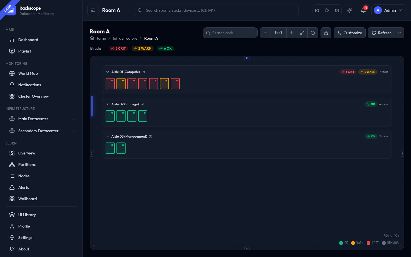
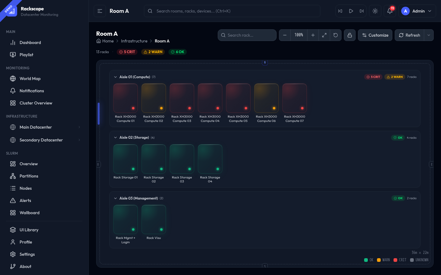
Rack styles
Open the Customize panel (top-right button) to change the rack display style. The style is persisted per-room in localStorage.
Standard (default)
Large rack cards showing a colored occupancy fill from the bottom + status dot. Best for getting an overview with the full rack name visible.
Compact
Small square cards with a status dot. Maximum number of racks visible on screen without scrolling. Ideal for very large rooms.
Dot
Minimal — a tiny colored square per rack. Highest density. No name shown by default. Best for NOC wallboards with many rooms visible at once.
Glass
Frosted-glass effect cards with a subtle gradient and a status dot at the bottom. Visually distinctive for dark-mode NOC displays.
Slots
Horizontal slot bars stacked vertically. Each bar represents a fraction of rack occupancy. Compact and readable.
Cells (proportional)
Each rack is rendered as a grid of 2U cells that map directly to the physical rack topology. A cell is filled when a device occupies that U range.
- Filled cells: colored by rack health state (red = CRIT, amber = WARN, green = OK)
- Empty cells: subtle outline border
- Devices at the top of the rack (e.g. a switch at U40) appear as filled cells near the top; compute chassis at the bottom appear near the bottom
- Cell size and position are computed from actual
u_heightvalues in the device catalog — exact, not estimated
42U rack → 21 cells · 48U rack → 24 cells (2U per cell, common divisor for both standard rack sizes).
Pixel
A 4×8 pixel grid (32 dots) per rack. Dots fill from the bottom based on exact rack occupancy. Compact and visually striking.
Gauge
Tall vertical gauge cards showing the exact occupancy percentage and a filled bar. Best for capacity planning dashboards.
Industrial
A rugged, high-contrast style with thick borders and filled occupancy strip. Optimized for industrial displays and harsh lighting environments.
Node
Wider cards that show a compact node grid — each node represented as a small colored square matching its health state. Best for compute-heavy rooms where node-level visibility matters.
Customize panel
Click Customize to open the settings panel. All options are persisted per-room in localStorage.
| Option | Description |
|---|---|
| Rack style | Visual representation (Standard, Compact, Dot, Glass, Slots, Cells, Pixel, Gauge, Industrial, Node) |
| Rack name | Show / hide the rack name label below each card |
| Rack label | Show / hide the rack ID badge (monospace, smaller) |
| Sort by severity | Sort racks within each aisle: CRIT first, then WARN, then OK |
| Rack align | Left-align or right-align racks within the aisle band |
| Aisle align | Aisles stack from the top or bottom of the canvas |
| Grid | Show/hide the background grid on the room canvas |
| Cardinal edges | Show N / S / E / W orientation labels on the room border |
| Door | Show/hide the door marker on the room border |
| Door label | Show/hide the label text on the door marker |
| Dimensions | Show room dimensions (e.g. 36m × 22m) in the bottom-right corner |
| Wheel zoom | Enable/disable mouse wheel zoom (disable for touchpad users who accidentally zoom) |
| Legend | Show/hide the OK / WARN / CRIT / UNKNOWN color legend in the bottom-right |
| Hidden aisles | List of aisle IDs that are permanently collapsed |
Rack detail panel
Clicking a rack opens the Rack detail panel on the right side:
- Front / Rear toggle (only shown if the template defines
rear_layout) - Full RackElevation view with actual device positions
- Per-device health state and node grid
- Temperature, power, and PDU metrics (loaded on demand)
- View rack → button to navigate to the full Rack Page
Keyboard shortcuts
| Shortcut | Action |
|---|---|
Ctrl + scroll | Zoom in/out |
Escape | Close rack detail panel |
Ctrl+K | Focus the global search bar |