UI Library & Design System
Rackscope's frontend is built on a comprehensive design system inherited from TailAdmin, enhanced with infrastructure-monitoring-specific components.
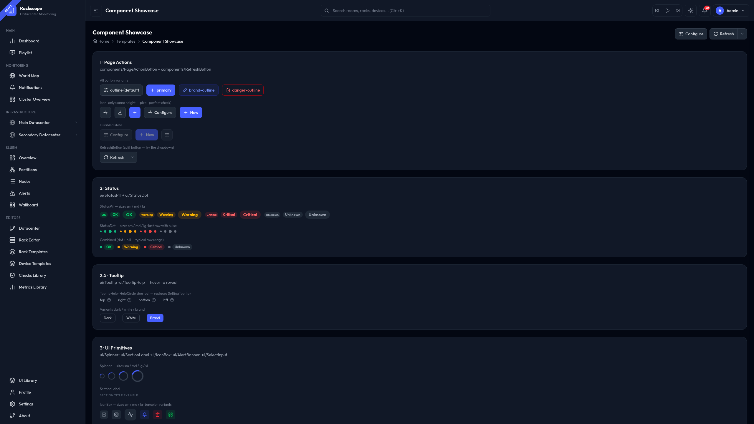
The live reference for all components is available at /templates/default in every running
Rackscope instance. It renders every component with the currently active theme — buttons, forms,
status indicators, overlays, feedback states, and more — all interactive.
Design System Overview
The visual foundation of Rackscope is built on three pillars:
- TailAdmin base: A production-grade admin UI kit providing consistent layout patterns, spacing, and component primitives.
- Tailwind CSS v4: Utility-first styling with full support for arbitrary values, custom palettes, and runtime theming.
- Outfit font: A geometric sans-serif typeface optimized for legibility on dense data screens and NOC wallboards.
Dark mode is treated as the primary experience. Every component is designed dark-first and then adapted for light mode. This matches the expectations of NOC operators and on-call engineers working in low-light environments.
Accessing the UI Library
The UI Library is a live, interactive reference page built into every Rackscope instance. It renders all components using the currently active theme so you can preview the effect of palette and accent changes in real time.
To open the UI Library:
- Navigate to
/templates/defaultin your browser while Rackscope is running, for examplehttp://localhost:5173/templates/default. - Alternatively, navigate to
/ui-libraryfor the full component catalog. - Or go to Settings > Appearance and click the Open UI Library link.
The page is read-only and does not affect any configuration.
Theme System
Rackscope ships with a fully configurable theme system. Changes are applied instantly and
persisted to localStorage — no reload required. Theme settings live in Settings > Appearance.
Accent Colors
Accent colors control interactive elements: active sidebar items, focused inputs, primary buttons, progress indicators, and link text.
| Name | Hex | Character |
|---|---|---|
| Indigo | #465fff | Default. Professional, neutral, high contrast. |
| Violet | #7c3aed | Bold. High visibility on dark backgrounds. |
| Emerald | #059669 | Calm. Common in infrastructure tooling. |
| Rose | #e11d48 | Alert-like. Use with caution in NOC contexts. |
| Amber | #d97706 | Warm. Pairs well with dark and solarized palettes. |
Dark Palettes
| Name | Character |
|---|---|
| Void | Near-black backgrounds (#0a0a0f). Maximum contrast, minimum eye strain. Recommended default for NOC. |
| Navy | Deep blue-gray tones. Familiar to users of traditional network monitoring dashboards. |
| Forest | Dark green-tinted surfaces. Low-fatigue for long shifts. Pairs well with Emerald accent. |
| Matrix | Special mode — see Matrix Mode below. |
Light Palettes
| Name | Character |
|---|---|
| Slate | Cool neutral grays. Clean and professional. Recommended for office environments. |
| Warm | Slightly warm whites. Reduces blue-light exposure on extended sessions. |
| Cool | Crisp blue-white tones. High contrast for bright rooms. |
| Solarized | Ethan Schoonover's classic palette. Familiar to terminal-heavy users. |
Changing the Theme
- Open Settings from the left sidebar.
- Navigate to the Appearance section.
- Select an accent color and a palette.
- Changes apply immediately across the entire interface.
Matrix Mode
Matrix mode is a special Easter egg palette activated by selecting the Matrix dark palette in Settings > Appearance.
When active, it applies a CRT aesthetic to the entire interface:
- Phosphor green typography on near-black backgrounds
- Scanline overlay simulating an old cathode-ray monitor
- Crosshair cursor replacing the default pointer
- Monospace font substituted for data tables and code blocks
- Subtle flicker animation on status badges
Matrix mode is fully functional — all monitoring data, health states, and navigation work normally.
Matrix mode was designed for after-hours NOC shifts and conference demos. It is deliberately distinctive. Do not deploy it as the default theme in shared environments unless your team agrees.
Component Categories
All components are documented and showcased live at /templates/default. The library is organized
into the following categories:
| Category | Key components |
|---|---|
| Buttons & Actions | Primary, Secondary, Ghost variants; sizes xs/sm/md/lg; icon buttons; loading states |
| Badges & Labels | Solid and outline variants; semantic health-state colors; sizes sm/md |
| Alerts & Banners | Info, Success, Warning, Error; dismissible; AlertBanner component |
| Forms | Text inputs, textareas, SearchInput, SelectInput, ToggleSwitch, StepperInput, NumberInput, SegmentedControl, FilterPills |
| Overlays | Modal, ConfirmationModal, Drawer, DrawerHeader, Tooltip, TooltipHelp |
| Status Indicators | StatusPill, StatusDot, IconBox, KpiCard, StatefulSaveButton |
| Layout | PageHeader, PageBreadcrumb, SectionCard, Tabs |
| Feedback | LoadingState, EmptyState, ErrorState |
| Charts | Bar, line, radial/donut (ApexCharts); heatmap; all theme-aware |
See the Design System section for usage patterns and developer guidelines.
Health State Colors
Health state indicators appear throughout Rackscope: rack grids, device panels, node lists, badges, and chart legends. These colors are fixed regardless of the active accent or palette to ensure consistent operator interpretation.
| State | Color | Hex | Usage context |
|---|---|---|---|
| OK | Green | #10b981 | All checks passing, node up, no active alerts |
| WARN | Amber | #f59e0b | At least one warning-level check failing |
| CRIT | Red | #ef4444 | At least one critical-level check failing |
| UNKNOWN | Gray | #6b7280 | No data returned, check error, or unmonitored |
Health states aggregate upward through the topology: Node → Chassis → Rack → Room → Site. The worst state at any child level propagates to the parent.
Dark Mode Best Practices
Rackscope is tested in both light and dark modes before every release.
- Default to dark: Set dark mode as the default for any shared NOC or wallboard deployment.
- Test both modes: Any component change must be visually verified in both Void (dark) and Slate (light) before shipping.
- Never rely on color alone: All status indicators pair color with an icon or text label.
- Contrast targets: Rackscope targets WCAG AA contrast ratios for all text on backgrounds.
Easter Eggs
Terminal overlay: Type help anywhere in the interface (while no input is focused) to open a terminal-style overlay displaying available keyboard shortcuts and a brief system status summary. Dismiss it by pressing Escape or clicking outside the overlay.
Matrix mode: Described in detail in the Matrix Mode section above.
These features are cosmetic and do not affect any monitoring data or configuration state.