Views
Datacenter View
URL: /views/site/:siteId
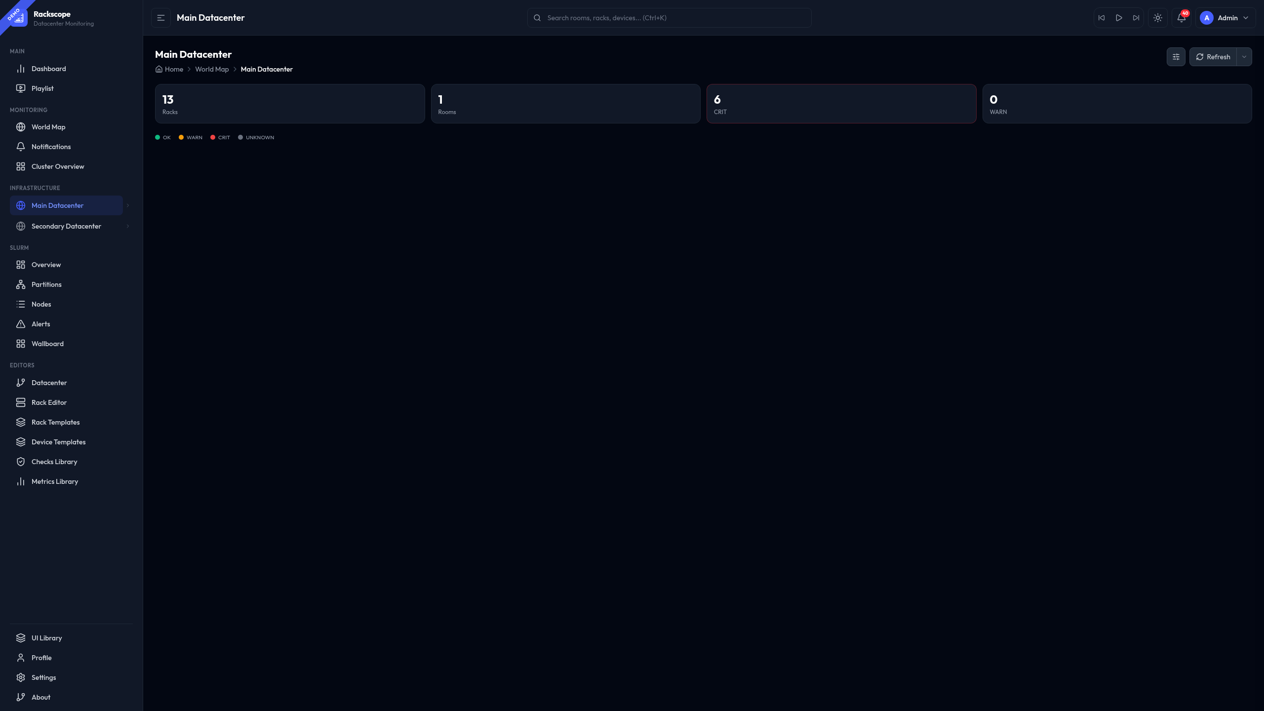
Site-level overview showing all rooms with live rack health states.
Features:
- Grid view — room cards with a mini rack grid (colored squares per rack), health badge, CRIT/WARN counts and ring highlight on critical rooms
- List + Detail view — compact room list on the left, detail panel on the right with rack grid, alert counts, and aisle tags. The detail header shows the room name, health badge, and View Room → button on the same line
- Config drawer (
⚙button) — toggle Grid/List, adjust rack square size (Small/Medium) - Color legend (OK/WARN/CRIT/UNKNOWN) inline below the KPI bar
- KPI bar — total racks, total rooms, CRIT count, WARN count
- Hovering a rack square shows a HUDTooltip with rack name and node health counts
- Auto-refresh with interval selector
Navigation: World Map → click "View datacenter" in the site panel · Sidebar → click the site name in the Infrastructure tree.
World Map
URL: /views/worldmap
Shows all sites on a world map with health status markers.
Layout modes (toggle in page header):
| Mode | Description |
|---|---|
| Split (default) | 2/3 map + 1/3 sidebar (stats, site list, selected site) |
| Stacked | Full-width map with SM/MD/LG height presets |
Map styles (Settings → Views → World map style):
Minimal · Flat · NOC · Retro · Midnight
Controls:
- Layout toggle: Stacked (all rooms in a column) or Split (side by side)
- Height toggle: S / M / L — compact to expanded room cards (Stacked only)
Features:
- Click a site marker → tooltip shows rooms + rack count + alert state
- Click a site in the sidebar → detail panel with clickable rooms
- Stats bar: Sites · Rooms · Racks · CRIT/WARN alert counts (live)
- Legend: OK / WARN / CRIT colors derived from plugin config
Room View
URL: /views/room/:roomId
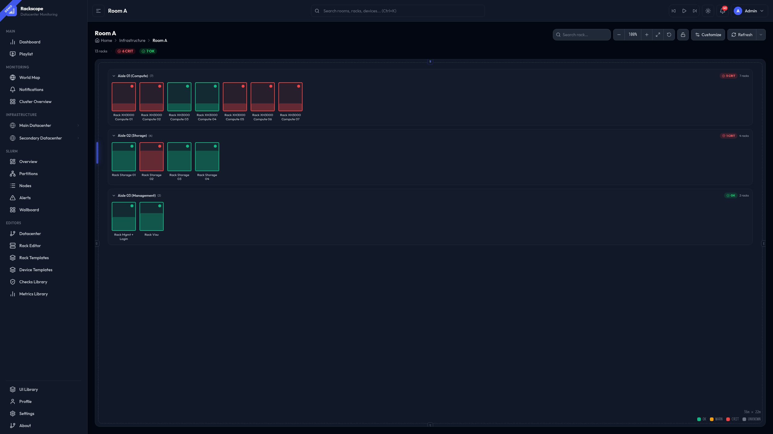
Floor plan with all racks grouped by aisle. Each rack is rendered as a visual card whose style and size are fully configurable.
See Room View — detailed guide for the full reference: all 10 rack styles with screenshots, Customize panel options, navigation shortcuts, and the rack detail panel.
Rack View
URL: /views/rack/:rackId
Full physical rack front/rear view with every device at its exact U position.
Features:
- Node slots color-coded by health state
- Rack components (PDUs, HMC) on side rails with WARN/CRIT indicators
- PDU alerts visible directly on the component
- HUDTooltip on hover: node name, temp (arc gauge with thresholds), power, alerts
Device View
URL: /views/device/:rackId/:deviceId
Device with per-instance tabs showing metrics and health checks.
Cluster View
URL: /views/cluster
Compact rack overview across the entire topology. Useful as a NOC wallboard.
Features:
- Drag & drop to reorder racks (edit mode)
- Add/remove racks from any room/aisle
- Card size: S / M / L
- Layout: Horizontal scroll · Wrap · Wrap-auto
- Auto-refresh with interval selector
HUD Tooltip
All rack/device/node views share a configurable tooltip system.
Configure in Settings → Views → Tooltip style:
| Style | Description |
|---|---|
| Tinted (default) | Gradient header tinted by alert severity |
| Compact | 2px top bar, split temp/power columns |
| Glass cards | Glassmorphism + 2 equal metric cards |
| Split layout | Info left, arc gauge right |
| Terminal | Monospace HPC style |
| Ultra-compact | 220px for cluster/wallboard views |
Color aura: optional glow shadow matching severity (configurable).
Thresholds: per device template — configure in display_thresholds in the template YAML,
or globally in config/metrics/library/node_temperature.yaml.